TRANSFORMING SPACES WITH ARCHITECTURAL GLASS — UPLIFTING AND ENHANCING HOW WE LIVE AND FEEL
I make bespoke glass for architectural settings, whether that be public buildings, corporate offices, private homes or outdoor spaces.
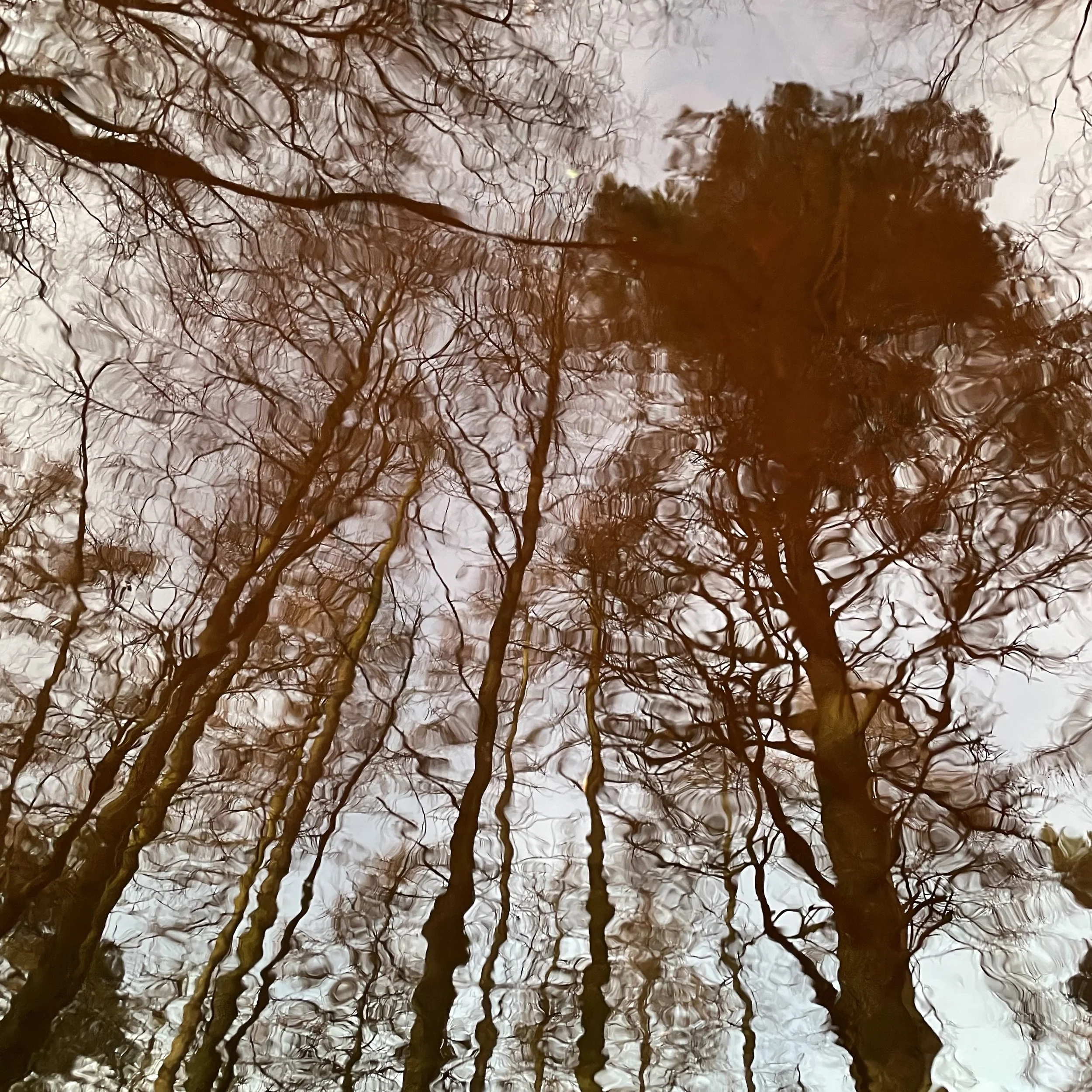
My artworks respond to their environment and change in relation to the varying light of day and seasons. Delicate and complex and inspired by the natural world, my designs encourage close looking, a slowing down and a re-connection with nature.
I explore ideas in whatever way works best, whether that be drawing, printmaking, photography, film or painting, all of which inspires my work with glass.
As well as working to commission, I exhibit in galleries and share my work through community projects and courses. I was awarded a PhD in Architectural Glass from the National Glass Centre, University of Sunderland and also teach undergraduates there.
If you have a space you want to transform, a project in mind, or you want to bring a bit of what I do into your life I would love to hear from you! Let’s start a conversation. Drop me a line on rachel@rachelwelford.co.uk or give me a call on 07740 309553 or visit Work with me

Glass for domestic spaces

glass for PUBLIC SPACES — DESIGNS FOR THE WIDER WORLD
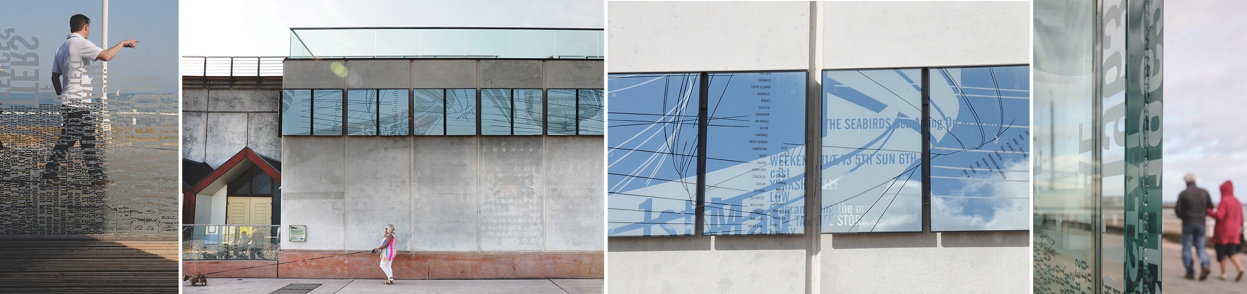
glass for PUBLIC SPACES — DESIGNS FOR THE WIDER WORLD
New shop coming soon
Subscribe below to discover my latest products and receive introductory offers!


NEWS / JOURNAL